Five Fields Flower Farm
JANUARY 2020, 6 WEEKS
BRAND IDENTITY
The Project
As Five Fields Flower Farm evolved, so did its goals, target audience, and product offerings. We knew a brand refresh would allow this small business to realign its identity with these changing dynamics. It also provided an opportunity to update the visual elements, messaging, and overall perception of the brand to better resonate with current and prospective customers.
My Role
Lead Visual Designer:
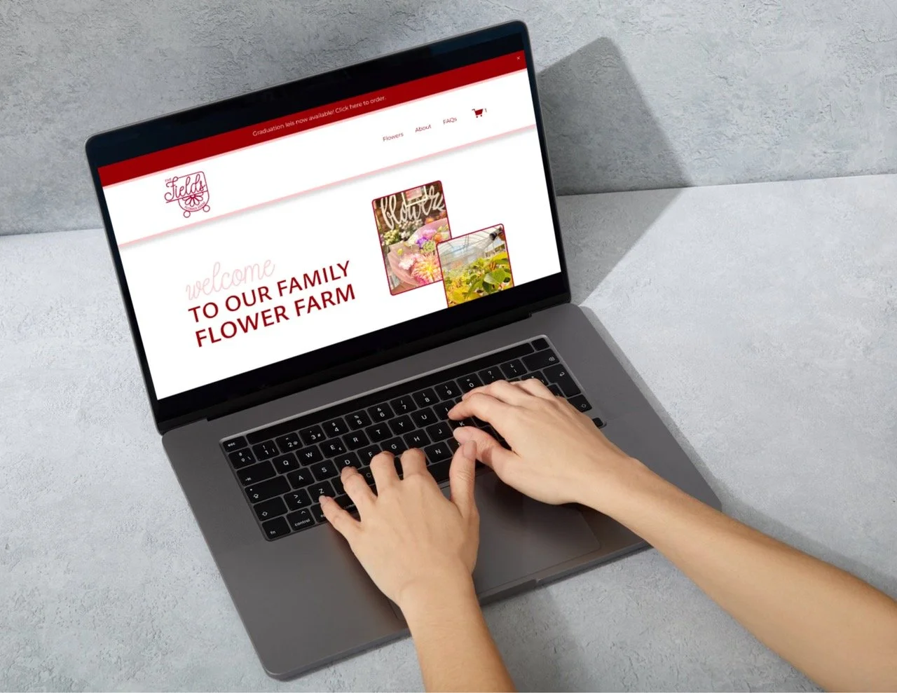
Website UX/UI, brand design, packaging, marketing material, and merchandise design.
Objectives
A streamlined ordering process (website)
Clarifying messaging to the community (socials)
A storytelling logo (branding)
The Challenge
The homespun nature of the flower farm’s business structure worked well at first. However, as they grew in popularity they needed to be able to streamline customers as well as capitalize on their online following. They wanted to convey their values, their story, and their business structure in a simple and intuitive way.
The original branding, while having its unique qualities, presented certain challenges that needed to be addressed. Notably, there was inconsistency in the choice of colors, which created a disjointed visual identity that didn’t fully align with the brand’s mission and values. Furthermore, the fonts used tended to lose clarity and cohesiveness when scaled down to smaller sizes, leading to difficulties.
Target Groups
Livermore Locals
Local Bay Area Residence for Workshops
Local Businesses and Weddings
The Approach
We began this process by thoroughly analyzing their most ardent supporters—their cherished customers.
Through meticulous research, we confirmed that their primary customer base our primary customer base consists of middle-aged women, typically falling into the upper-middle-class bracket, who consider flowers a staple in their weekly to biweekly routines.
The Findings
Defined client (middle-aged women, typically falling into the upper-middle-class bracket)
Defined pain points (ordering and pickup)
Received negative feedback on current branding as it “did not convey the message/story”
The Solution
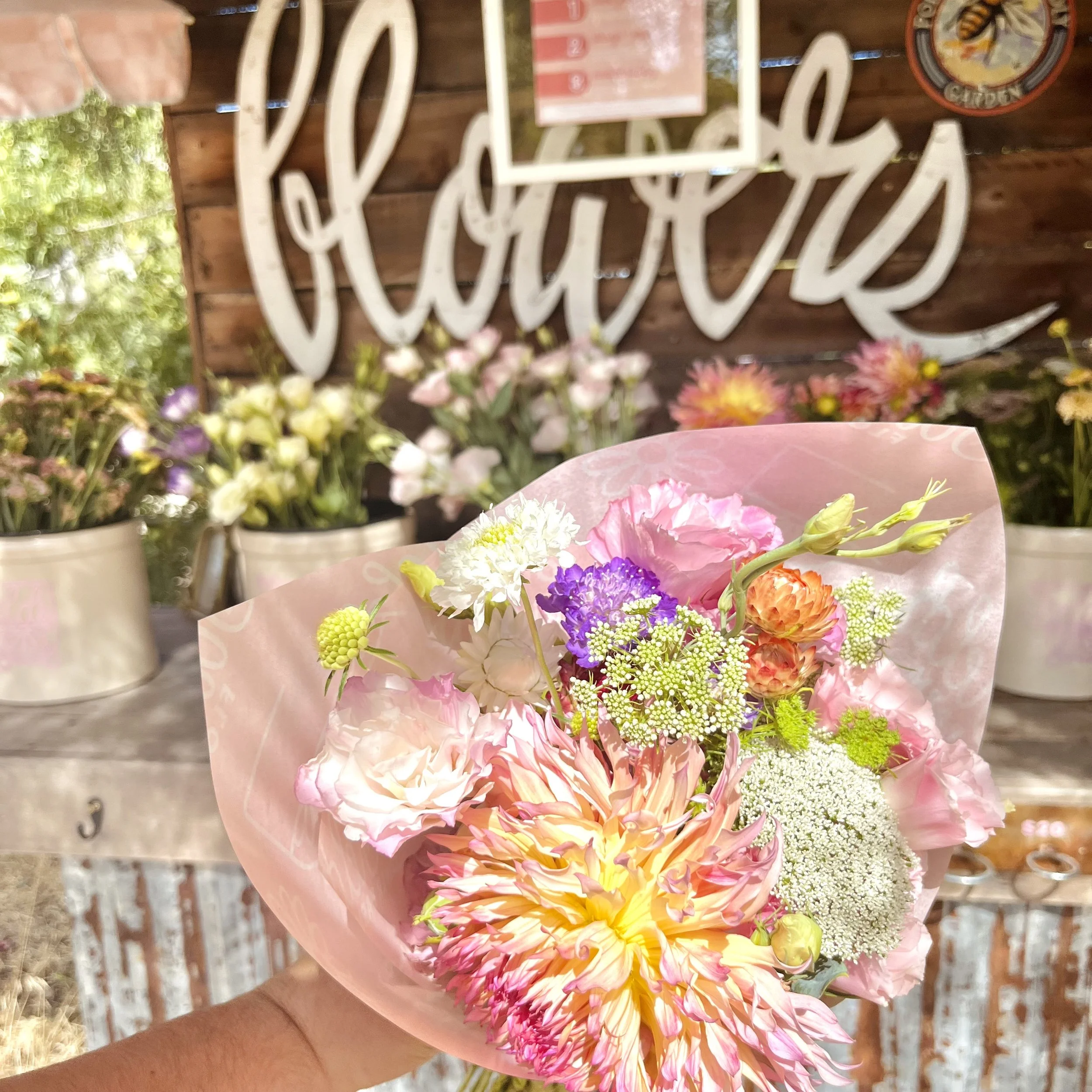
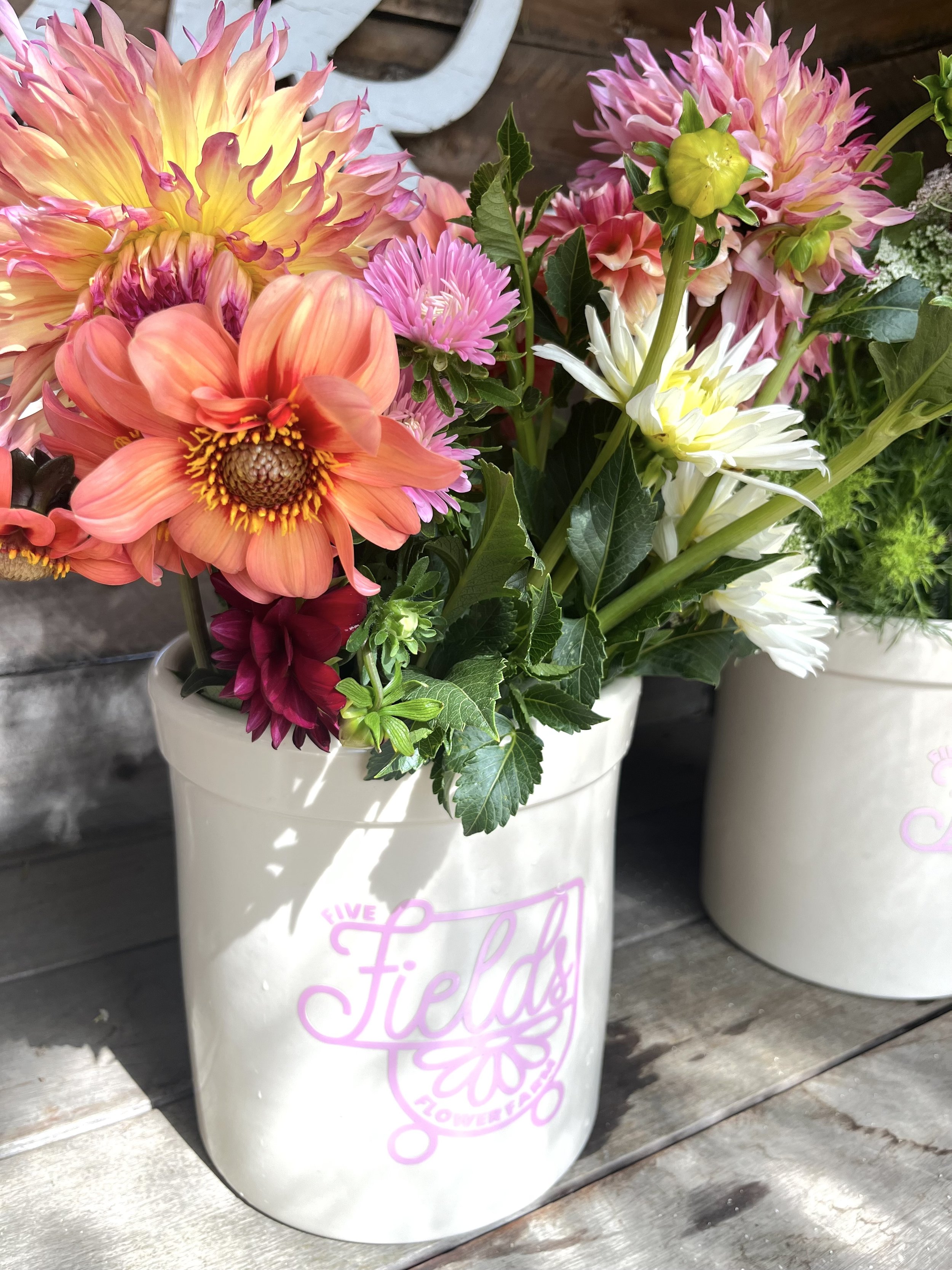
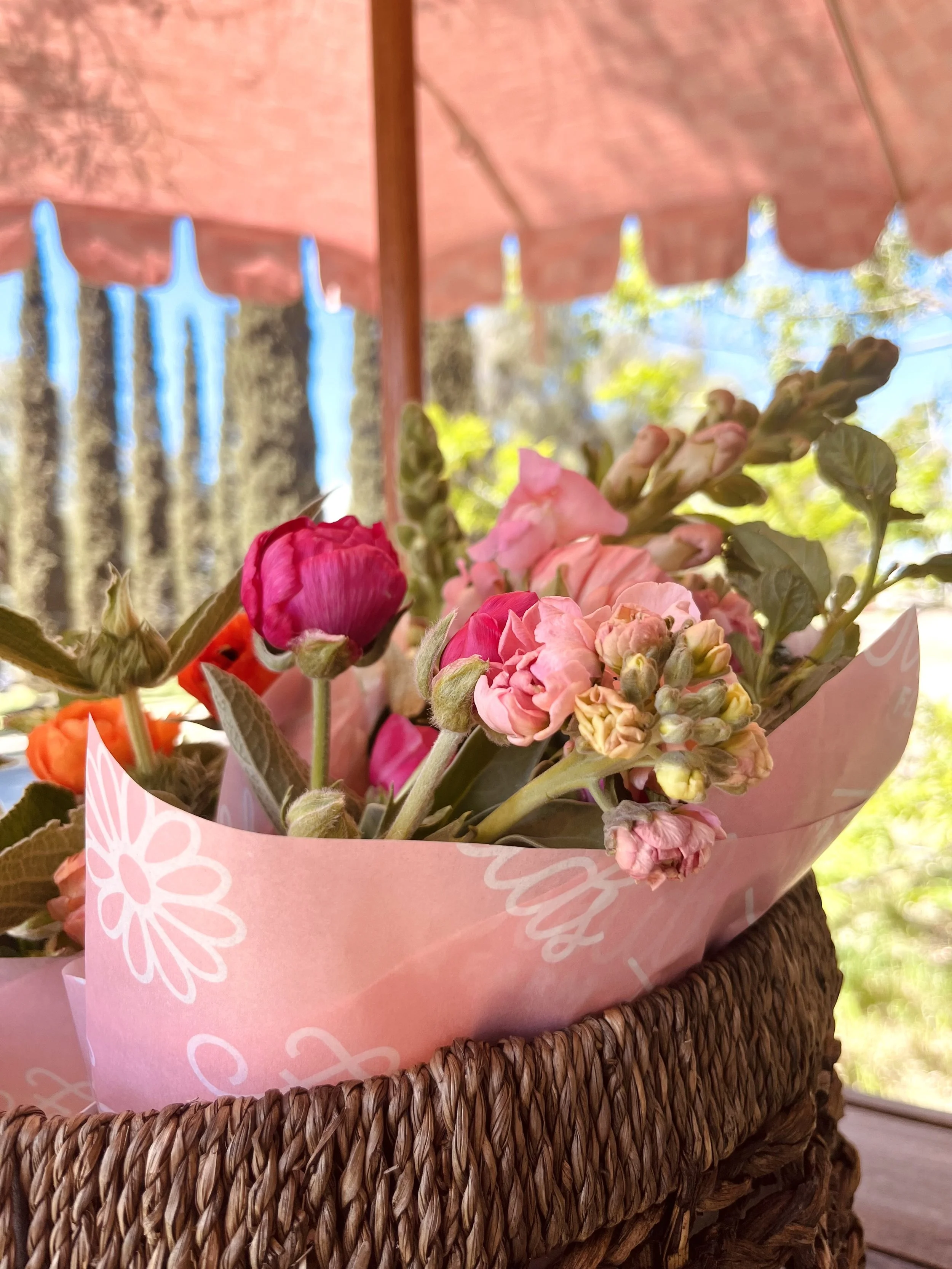
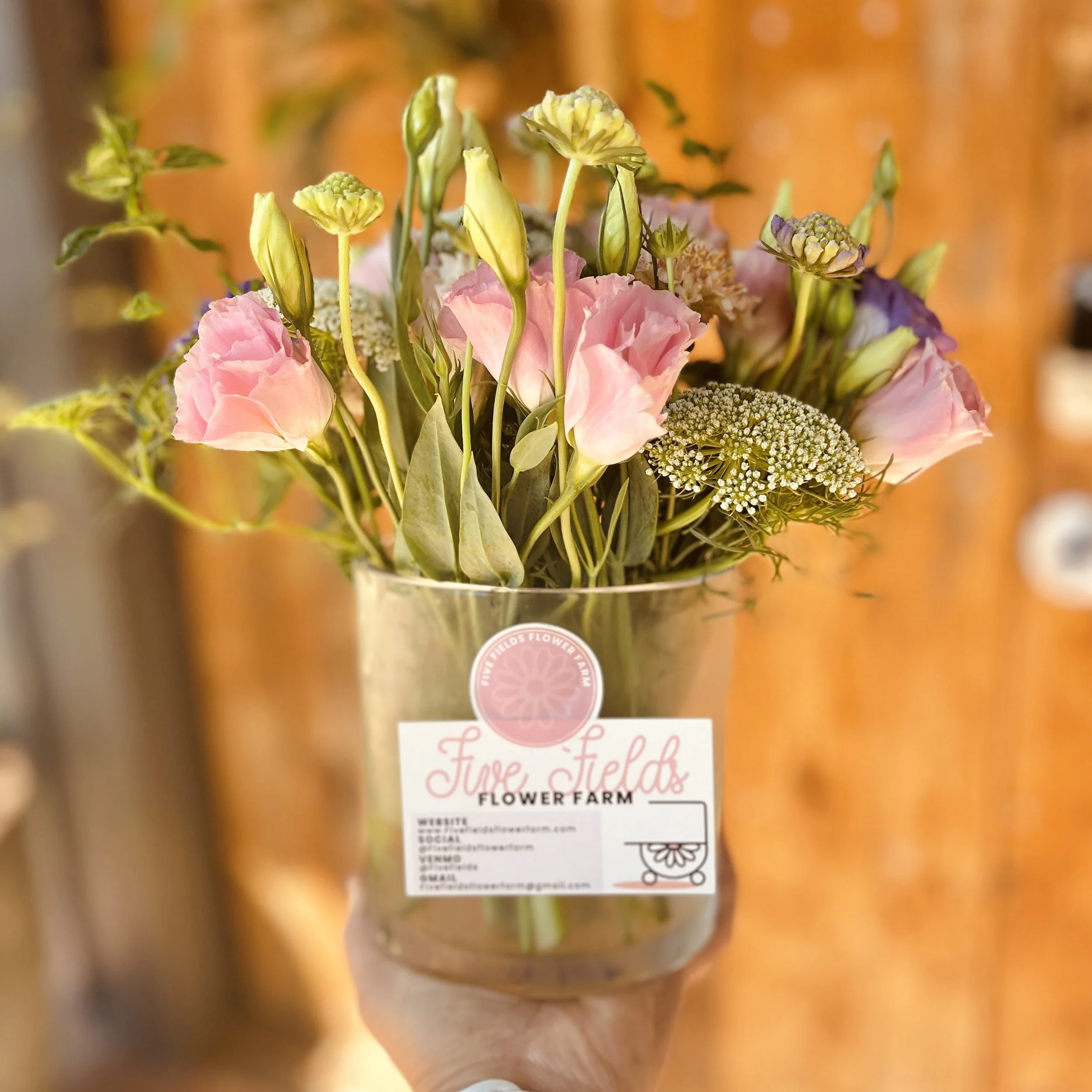
The final design was loved by the business owner and customers alike. It seamlessly integrates across various facets of our business—packaging, marketing, and social media. Its versatility and cohesive aesthetic made it a standout choice for their packaging. It not only represented their brand’s commitment to simplicity but also lent itself beautifully to their marketing materials, providing a unified and memorable visual identity.
Moreover, this collaboration underscored the profound impact that marketing and design can have on a brand’s success. The journey validated the significance of creating a compelling visual identity that resonates with customers and reinforces our values. It was a powerful reminder of how businesses, no matter their size, can drive positive change and make a meaningful impact on both their community and the planet.
Since the implementation of my designs, Five Fields Flower Farm has experienced a remarkable surge in success. In six months, they boasting an impressive 20% surge in sales, when compared to the previous year. This substantial growth underscores the power of effective design and branding, demonstrating their profound impact on the farm’s ability to engage customers and drive substantial revenue gains.

